Tuesday, December 13, 2011

Indian Tarry Out


Hello,

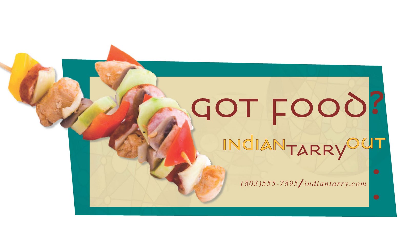
Doing these series of ad boards was so fun. I got inspired early on and throughout the project. We were to concept and produce a series of ad boards in different sizes for display ad billboards, bus cards, taxi cards and shelter signs. There were specific size ratios to follow for each kind of display. We had to choose a theme and concept along the lines making people aware of the restaurant. I chose the tasty East Indian carry out theme. The color scheme was the easiest part. Which elements to keep or lose were the most challenging.

Researching for this project was amusing. The Indian culture uses a lot of musical elements to express their background like dancing and performing. They have a colorful and playful way to dress as well design. Their food consists of a lot of Indian spices, herbs, vegetables and fruits. They practice vegetarianism in this culture. Vegetarianism is a plant-based diet with or without eggs, dairy or meat (red meat, poultry and seafood). They’re very environmental, they don’t believe in eating any animal products including eggs, dairy or honey. Semi-vegetarian diets consist largely of vegetarian foods but may include fish or poultry

Got Milk?


Hello,

My digital photography instructor gave the class some very valuable photography tips. One of the best times to shoot a photograph outside is in the morning. Never point your camera towards the sun because it causes over-exposure. Always move in close for a close-up picture. It’s more interesting to see an odd number of objects in a picture. The further back you get brings the background into clearer focus. Look for texture such as the side of a building or dirt to add more quality to your photo.

The composition introduced is my People in Advertising Photography project. We were to create our own Got Milk Ad using photography shot by ourselves. The young lady in the photo, Cerayia Masheka Etheredge is my neighbor. I placed whip cream above her lip to illustrate a milk mustache. Another one of my neighbors, Candice Foulks was my assistant for taking this photo. Candice used a board to help position the sun on my subject. This photo was actually shot in the trunk area of her truck. My tripod allowed me to get a good focus on Cerayia and blur out the background. I played around with the text a couple of times, keeping Cerayia the main focal point. I wanted some text but not to overpower the photo. The text placement was the most challenging on this layout.

The Last Resort


Hello,

This newsletter layout was done in Digital Prepress class. We had to create a composition as a two-sided tabloid (11X17) document. One of our tasks was to use four to six images. I had fun with this project because I felt like that was my breaking out of my shell time and start designing how I wanted to. The color scheme was easy but the tracking/leading part had its difficult moments. Doing this layout helped me understand grids and the structure of a layout better. This assignment also made me understand what preflight meant better. The preflight will tell a reader whether all production issues have been taken care of and the document is ready for print production. Always have given you client a PDF version of the work along with the other mechanical elements.

Classy Couture Coupon


Hello,

I had an English instructor that made my class develop our own informational cheat sheet about plagiarism. My sheet states copy & paste is the number one type of plagiarism. Taking a sentence and changing one or two words around is word switch plagiarism. Style plagiarism occurs when you use another author’s rhythm and words. Metaphor plagiarism is copying another author’s creative style. Taking a thought from a source without attributing to the author is idea plagiarism. Try to avoid intentional plagiarism, which is when a writer knowingly copies the work of another author without acknowledgement.

The photo you see is my clutch purse I made in 3-D Fundamentals class. I used Sharpie markers, a Bristol pad, and a pair of old jeans and a glue gun. I love fashion so I had fun doing this project. I was browsing through some Coach Ad(s) on the Internet and felt inspired in Portfolio I class. I wanted the “C” pattern from the clutch to be emphasized on the background of the layout but I didn’t want to use Coach wallpaper. I created my own and called it Classy Couture. With my understanding of copyright laws, the shoe and solid blue wallet belongs to Coach, however I did change the color of the shoe and added a woven pattern. The placements of the objects were the most challenging, things being too big or too small. I didn’t have permission to use the shoe or wallet so this project is used as a promotional piece and not financial.

Repo


Hello,

My art direction instructor gave this project. We were to work in teams of two and create a poster that satirizes a popular film title, its characters and their appearance. My partner picked the movie Rio. I remember sitting in class, trying to think of what the concept would be then it hits me, Repo! The color scheme was the easiest part on this layout. The placement of the characters and debating on which to use was the most challenging.

I enjoyed this project because had one of the best partners you would want to work with. We collaborated very well together. No one was unheard or misunderstood. Every opinion counted throughout the project. This experience made appreciate how helpful having a partner can be. I know everyone wants to have their opinion stick out the most but if you stop and listen to others, the composition will be better than you could ever imagine it to be.

Tuesday, November 29, 2011

Hotelito Desconcido


Hello,

The picture shown is the stationery for a hotel resort in Mexico. This assignment was given in my Corporate ID and Branding class. We were to research the hotel provided by the instructor. My hotel name was Hotelito Desconcido, which means Unknown Hotel in English. Hotelito Desconcido is located in a marine turtle sanctuary and sea bird habitat. They are very eco-friendly (runs on solar power by day and candlelight by night). I wanted the concept to be simple and elegant. I did not want the design to be too busy by adding all the aspects the hotel has to offer into one piece. I used the top of the palafito (houses built over wood pillars by the sea) for the texture on the background. The hotel consists of twenty-four palafitos for their guests. I wanted the color scheme to have an earthy and beach theme.

I’m always the one up for traveling but somewhere that doesn’t have electricity might not be the place for me. I understand why people would consider going somewhere remote, to get away from it all but I’m just afraid I get out there and I can’t get back. There probably ways to get off the island if you want to but the fact I can’t call anybody from home and see how things are going would bother me. From the pictures, it looked beautiful and fun-filled but I would still be hesitant. This would probably be one of my bucket list options. The only thing stopping and scaring me is myself. One day I’ll probably will go on a remote island stay for about a week or so, no longer than that though.

Shakespeare in the Park


Hello,

This was another project that took a lot of tidy time completing. We were supposed to be on teams but it was only seven of us and I was left alone. Even though, I can work with other people, I prefer to have my own task and complete it on my time. Create and produce a poster highlighting a Shakespeare play performance in Central Park what we were to do. The illustration could have been made with magazine and other scrap cut & pasted in montage style. I picked Anthony and Cleopatra. I’ve always admired Cleopatra’s style so that fueled me through this assignment.

I skimmed through some pictures on the Internet, trying to find one that would fit into the layout and then it hits me, I’m going to make my images out scraps. Cleopatra and Antony was made from print paper w/color on it, magazines, and colorful card stock paper, construction paper and grayscale paper. The font size and placement was the hardest for this one. At first it was too big then too small. The informational text was too close together then too far apart. You would think once you the main focus of a layout done it would be smooth sailing. What should stand out the most? What, When, Where and Who.